
Fourteen different graphs are available for plotting the pointing data to reveal systematic errors in the telescope system. Choose which graph to display by clicking the Graph pop-up menu on the Setup tab of the TPoint window (Telescope menu).
The general telescope analysis strategy is to plot different components of the errors against vs. time or position. Terms can then be added to the model to target any systematic effects that are seen. Some plots are more likely than others to have a mechanical interpretation and attention should be initially confined to these plots.
Pointing samples are saved in time order. Therefore, graphing y-data vs. N plots are useful for exposing shifts or drifts that have occurred during the pointing run. Other x-axis meanings can be contrived by appropriately sorting the observation file.
The numerous plots have a variety of presentation and diagnostic roles.
The scatter plot shows pointing errors displayed on a “shooting target.” The inner circle shows the RMS value, in arcseconds. As well as being a good way of presenting overall pointing performance, the scatter plot exposes errant observations and abnormal distributions.
Figure 257: Scatter Plot Example 1
Figure 257 contains a pointing sample error. Errors are more likely to occur with many samples since using fainter stars increases the possibility of misidentification. Note how the errant star causes a misleading tight clustering of the remaining stars by changing the overall plotting scale.

Figure 258: Scatter Plot Example 1 (continued)
shows two distinct distributions of stars. This is the result of a very large Declination axis and OTA non-perpendicularity on a German Equatorial mount. On the East side, the angle causes observations to be misplaced in one direction while on the West side, they are misplaced in the opposite direction.

Figure 259: Scatter Plot Example 1 (continued)
Figure 259 shows the same data after the Dec/OTA term has been added.
Figure 260 displays the residuals as error vectors on an orthographic projection, showing each observation and a line indicating the size and direction of the pointing error. The vectors (lines projecting from the square symbols that mark star positions) are the great circle continuations of the pointing residuals.

Figure 260: An orthographic projection showing error vectors.
Figure 261 represents an all-sky map (cylindrical HA/Dec projection) showing each observation and a line indicating the size and direction of the pointing error.
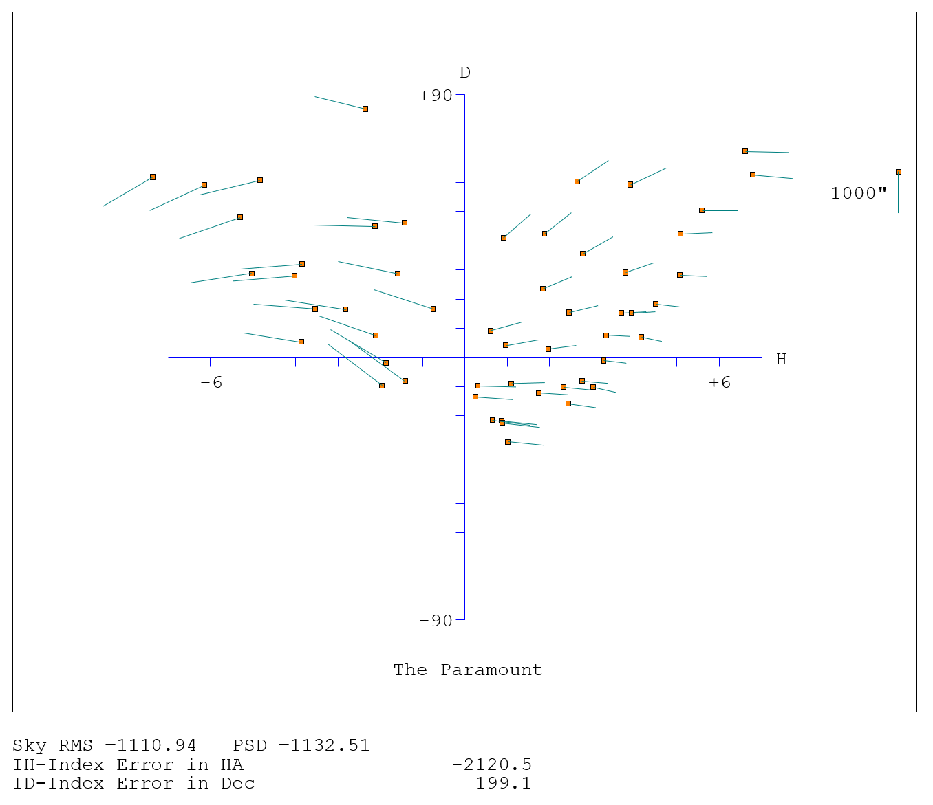
Figure 261: Error vectors on a Cartesian Cylindrical projection.
In Figure 262 each point is an observation, and the line indicates the size and direction of the pointing error. The position of the blob shows the direction of the preceding slew. This assumes that the data file contains all the observations in the correct order, and that hysteresis is related to the direction of the large-scale movements in cylindrical coordinates (either HA/Dec or Az/El). Summing the residuals oriented relative to the telescope movements makes a numerical estimate of the hysteresis.

Figure 262: Error vectors vs. telescope direction.
This graph looks for changing polar/azimuth axis misalignment. Each residual is interpreted as being due to a misalignment of the specified “roll” axis–either polar or azimuth as specified. A histogram is plotted to show if the residuals do, in fact, favor one direction. The mean direction is calculated and reported, and then the component of each residual in the direction of this misalignment is plotted.

Figure 263: Error Distribution graph.
Figure 263 plots multiple histograms that show various sorts of error distributions and is useful for testing whether the residuals are reasonably normal. In the example the X (east-west) plot shows a suspicious double peak.
The following graphs can be selected from the TPoint Module window:
· Observation number vs. Declination: The small rectangles are observations. The vertical axis is the declination component of the pointing error, in arcseconds. The horizontal axis is observation number (in effect time).
· Observation number vs. Hour Angle: The small rectangles are observations. The vertical axis is the hour angle component of the pointing error, in arcseconds. The horizontal axis is observation number (in effect time). n.b. Because the vertical axis is hour angle differences, large readings may appear at higher declinations.
· Hour Angle vs. EW on sky: The small rectangles are observations. The vertical axis is the east/west component of the pointing error, in arcseconds. The horizontal axis is observation number (in effect time).
· Declination vs. Declination: The small rectangles are observations. The vertical axis is the north/south component of the pointing error, in arcseconds. The horizontal axis is the declination coordinate in degrees.
· Declination vs. Zenith Distance: The small rectangles are observations. The vertical axis is the vertical component of the pointing error, in arcseconds. The horizontal axis is the zenith distance coordinate in degrees.
· Declination vs. EW on sky: The small rectangles are observations. The vertical axis is the east/west component of the pointing error, in arcseconds. The horizontal axis is the declination coordinate in degrees.
· Hour Angle vs. Declination: The small rectangles are observations. The vertical axis is the north/south component of the pointing error, in arcseconds. The horizontal axis is the hour angle coordinate in hours.
· Hour Angle vs. HA/Dec non-perpendicularity: The small rectangles are observations. The vertical axis is the amount of HA/Dec non-perpendicularity that would be needed to produce the pointing error, in arcseconds. The horizontal axis is the hour angle coordinate in hours.
· Changing Polar Axis Alignment: The histogram shows which hour angle meridian the polar axis would have to be moved along in order to reduce the pointing error: a single bin with a large value suggests the polar axis is not perfectly aligned. The blobs, one per observation, show how much of the pointing error could be accounted for by a polar axis misalignment: and even scatter suggests good alignment.
· Error Distributions: Each histogram shows the proportion of the pointing error in the nominated coordinate. X is east/west on the sky; D is north/south; S is left/right on the sky; Z is up/down; R is total error.
· Multiple Graphs: A selection of nine of the most useful plots. dX, dD and dZ are the east/west, north/south and vertical components of the pointing error, while dP is how much NP would be needed to explain the pointing error, all in arcseconds. HA axes are in hours, Dec and ZD axes are in degrees.
Bad observations usually stand out in one or more of the graphs. For example, in Figure 264, most of the observations are tightly clustered, while a single sample stands apart from the others, and appears to be wrong.

Figure 264: Scatter plot with an erroneous pointing sample.
To remove this from the model, click on the orange rectangle, then click the Ignore Pointing Sample Number <N> command in the pop-up menu.

Figure 265: Scatter diagram with the bad sample ignored.